There's the medical side and the financial side, EACH of which gave months of warning. I'm a big student of economics because I supplement my retirement by day trading, which I've done for decades. To be a successful trader means making and understanding charts. I'm trying to explain my chart below in a way that has a usable conclusion for you all, NOT to be political.
The good economy created in '09 by Bernanke (credit to where it's due) was being offset by actual growth in GDP till 2017. That's where the Govt cut income (tax cuts) and increased spending. Basically, the data shows "good economy" of the last couple years has been a sugar high. It's been a fake, funded by borrowing from ourselves and running the debt higher, as shown in the second chart. You can see it where the SPX stock prices keep going up while the indicators go down. So again, the current market fall is NOT a surprise due to the Coronavirus. The response to the virus of stopping the economy just made the downturn faster and harder.
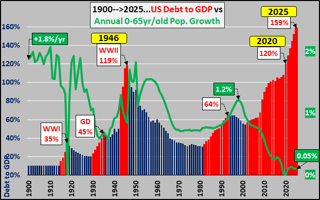
On the financial side, the second chart shows how Congress (not going to take sides) just said "hold my beer" when it comes to debt. This will end ugly to write off the debt. Us retirees on pensions, social security, or other people also on fixed income are going to get crucified.
The usable part of the post is to . . .
1. not chase this market, especially now that it is off the bottom, and to . . .
2. watch for an impending secondary fall, which has happened in previous collapses. See the red ovals in chart #1 and prior downturns in chart #3
For any other traders, note that we are about to hit the 200 day SMA, so the rise this week ought to hit stiff resistance soon.